When you’re serious about branding and understand its importance, you’ll probably get why a style guide is necessary.
Some people may think creating a branding style guide is silly and too “plannish” without enough doing.
We’ve seen companies thrive once a style guide is created and accessible. We’ve also seen companies make a style guide that is pretty much ignored.
How do you make a style guide that is used?
First, as we’ll outline below, you need the right stuff in a style guide. Second, you may need to help employees see its importance. It might be helpful to send employees a few examples of companies that are all over the map with branding (and point out their struggling profits and how it relates to their lack of branding focus). Then, show them a few examples of successful companies that have excellent branding and consistent use of their branding decisions. Show them those companies’ style guides and explain how sticking to it strengthens their brand. You can do all this with a quick gallery of images and not much text (so employees actually read your message).
Then, when you make your style guide, make sure it’s clear and quick to refer to. Put it on your company repository/board online, wherever that may be. Make templates so that people who create content don’t have to even think about how to format or style things. As much as possible, try to have templates for most things your company produces, and try to make those templates part of each creator’s workflow.
Why does a style guide matter?
If you think about it, you are bombarded with so many messages every day. You have people around you talking to you about what they care about; you have news outlets feeding you current events; you have social media with thousands of topics; you have podcasts, videos, etc. With all this input, a company needs to be very clear about who they are and how they can help you.
Here’s an extreme example: If I told you about a company I like–let’s say it’s called “The Awesome Company,” and I said they make lawn chairs and lawn mowers and lawn games and laundry soap and launching rockets, it might be difficult for your brain to really know how to think about the company. I mean, their products all have the sound “lawn/laun” in them, but that doesn’t necessarily give me a clear idea of what they’re totally about and why I should care.
Sometimes we see this in companies. They are giving people so many different ideas and messages about who they are that they end up not giving much, if any, message.
Here’s a better example: What if I started a dry cleaning company and I couldn’t decide what my biggest unique selling point (USP) was? What if on my business care and store door, I listed my top ten selling points? Would people memorize all those ten selling points and the next time they heard my name, would they remember all those selling points in conjunction with my name? Would they read the selling points at all? (The answer is most definitely “No!” We don’t even read the back of cereal boxes anymore.)
This is also a comment on the importance of branding in general, but my point is, we need to keep things simple for everyone’s over-messaged brain. We need to pick the one most crucial thing (our USP) that we want people to think of when they hear our company name. To this day, when I hear “Nike,” there’s a good chance that my brain will think “Just do it.” Simple messages win out over long, involved messages.
A style guide helps define exactly what that message is (both in word and in design). Once you have a well-define style, it’s easier for employees not to mess it up by putting out things with all kinds of other messaging and design. Those other messages and designs will muddy your brand and dilute it until it’s essentially invisible.
If your style guide is easily accessible and offers exact templates in all the file formats needed, you’re on your way to a much more clear message to the public.
What should I include in a style guide?
The best style guides are all-inclusive. By that, I mean that in addition to covering the look and feel for your brand, it also includes the messaging. The best style guides include:
- Title Page
- Why It Matters
- Messaging (including USP, supporting bullet points, 30/50/100-word descriptions)
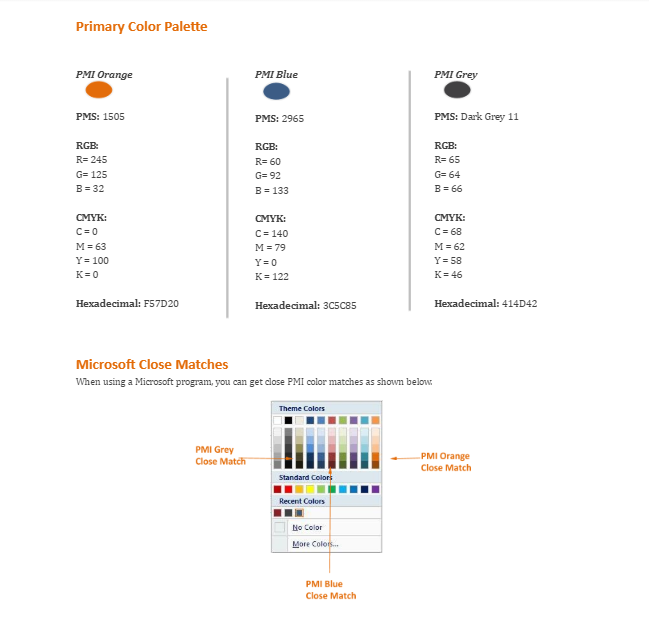
- Brand Colors
- Brand Logo (including logos for use on dark and light backgrounds)
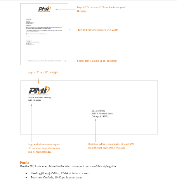
- Representative Samples of Branding Used Correctly (types of collateral that are used most often, such as an email signature or video intro/outro, plus many “look and feel” examples from the company’s every day content)
- Who to Contact with Questions
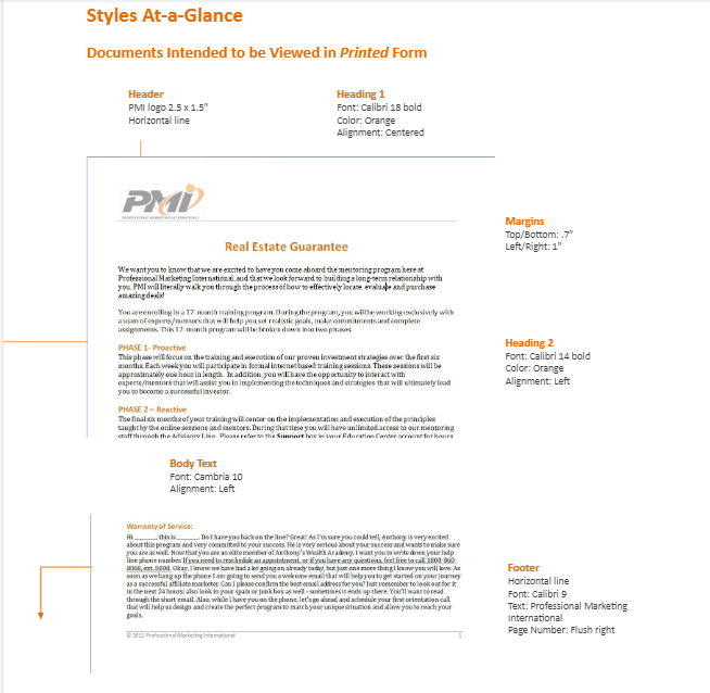
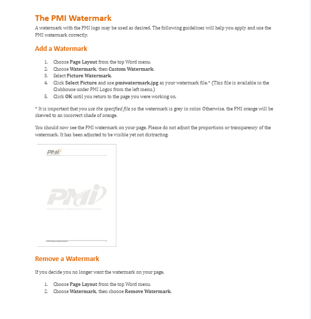
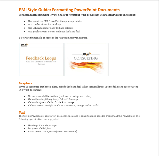
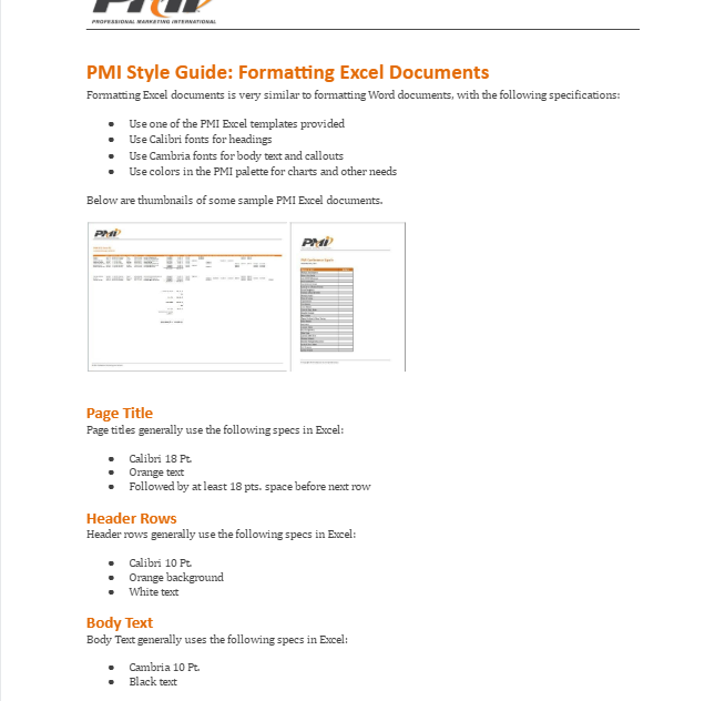
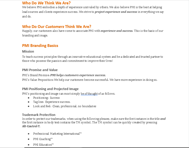
It doesn’t have to take forever to make a style guide. Just put together the decisions that have been made, and visually sample what everything should be. I’ll put a few example pages below.
Some sample pages from a style guide I created for a tech coaching company:
